Kitchen colour trends – interior designers reveal the 10 bold new shades to embrace in 2024
Discover the hottest new ways to get colourful in the kitchen this year…


Colour is arguably one of the fastest ways to date a kitchen, so it pays to keep a close eye on the latest kitchen colour trends when renovating. Fortunately colour forecasts aimed at our cooking spaces tend to be more timeless and liveable than those destined for the fashion catwalks.
Let's face it, unlike a cushion cover or lampshade, you can’t afford to fall out of love with the colour of your kitchen any time soon. If at all. However, while colour trends aimed at the kitchen do tend to be less daring than in other walks of life, that doesn’t mean there’s nothing new to report. Every year industry insiders, colour forecasters and paint brands announce their upcoming kitchen colour trend predictions – and there are always a few exciting options for those looking to shake things up on the colour front.
There’s usually also an overall ‘colour direction’ that shines through when compiling upcoming kitchen trends from a wide range of colour experts, and 2024 is no exception. Drum roll please; this year it’s pointing firmly towards warm, cosy and comforting colours that make you happy to stay home (and cook comforting foods).
Kitchen colour trends 2024
Yes, there are the expected gentle tweaks on all-time favourites (we’re looking at you green and blue) but there are also several trending colours on the horizon that haven’t been seen on kitchen cabinets for a couple of decades, if ever.
‘This year is all about being bold with colour, even in kitchen design, and we’re set to see a move towards warmer colour palettes with the emergence of reds, purples and even rich browns coming through,’ reports Richard Davonport, MD of Davonport Kitchens, who has his finger firmly on the colour pulse. ‘For the brave, they will use these colours throughout the kitchen, but for those wanting to dip their toes, these rich colours can offer a powerful contrast to understated neutrals.’
1. Warm terracotta

Yearning for warmer weather? Secretly wishing you could move to the Med? We can’t promise actual sunshine, but things are definitely warming up when it comes to popular kitchen cabinet colours for the year ahead.
Magnet’s head of design Jen Nash is predicting a shift towards warm, earthy colour palettes, particularly terracotta-based tones, which, she says, are set to define kitchen aesthetics in 2024. ‘The terracotta warmth of our new Nutmeg shade creates a cosy, inviting atmosphere that will suit any kitchen,’ she says.
Paint brand YesColours has also got terracotta on its radar for kitchens this year, creative director Emma Bestley explains why: ‘Shades of terracotta give a cocooning feeling and that envelops you in a big warm hug. Its burnt, bronzy richness will immediately make you feel comforted and grounded and would look incredible drenched in our most-used rooms of the home such as the kitchen and dining spaces.’
Terracotta can work well in full-drip mode, i.e. used from floor-to-ceiling, but we like the softer approach of this Magnet kitchen, which features terracotta toned with soothing Limestone neutrals.
2. New take on black

OK, black kitchen ideas are totally timeless and never get old, but this year it’s expected to take a more low-key direction by working with natural finishes and rustic moments. ‘Cabinetry in inky blacks and rich, saturated tones always offer a high-end look and feel. Sleek and stylish, like a little black dress, it's a design that will never go out of fashion,’ agrees Elizabeth Sherwin, creative director, Naked Kitchens. ‘Paired with woods such as oak or walnut and layered with brass or copper detailing, black kitchen schemes can deliver a wealth of understated luxury and warmth.’

Fashion graduate and former kitchen designer Elizabeth Sherwin is now the creative director at Naked Kitchens, a bespoke kitchen company with a focus on contemporary and functional design.
3. Coastal blues

If you’re dithering between green or blue kitchen ideas and want to be fashion-forward about it, take colour consultant Betsy Smith’s advice and plump for the latter. ‘Blue is increasingly replacing greens in interiors. Blue is still connected to the natural world, and this hike in interest is partially driven by the trend and popularity of wild swimming. Expect to see effortless, watery pale tints combined with fluid shapes and shiny reflective finishes - polished metal, stone, marble, and mirror,’ she says.
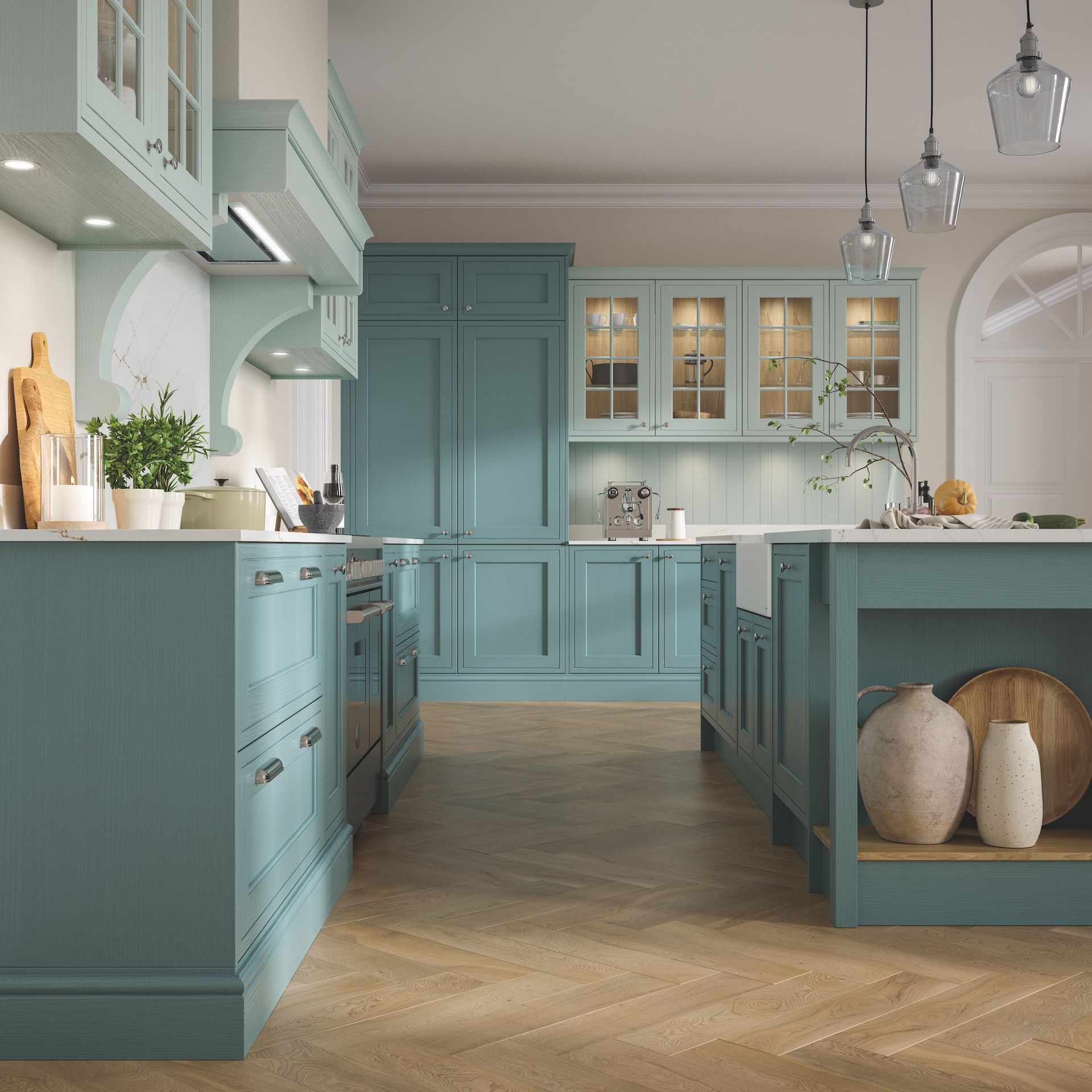
In kitchens, this watery aesthetic can best be translated via coastal blues, like the Sea Salt and Beach House blues shown in this classic design by Masterclass Kitchens. ‘Moving away from the deep navy and royal blues that have dominated the blue palette in recent years, these coastal blues feel fresher, lighter and better connected to nature,’ adds Cassie Jones, brand manager, Masterclass Kitchens.

A fine artist and interior design guru, Betsy Smith was Sir Terence Conran's head of visual display for more than 25 years before establishing a successful freelance career. Alongside many private clients, she works closely with Graphenstone, as the brand’s lead colour consultant.
4. Deepest green

Green still very much your scene? Take it to the dark side with a dramatic green-black iteration that changes with the light – and don’t be shy about where you put it. Benjamin Moore advocates carrying dark green-black onto the walls, woodwork and even overhead, for a cocooning effect with serious punch. Try Little Greene’s Obsidian Green, or Studio Green by Farrow & Ball, or take a look at these green kitchen ideas.
'The green undertones of our Regent Green, shown here, creates a richness that offers a softer alternative to black and a more modern substitute to dark grey,’ says Helen Shaw, of Benjamin Moore. ‘Opt for this deep pine shade to envelope a moody kitchen - finish the look with natural materials to achieve an organic, fresh take on a green kitchen.’
5. Red accents

For anyone keen to explore 2024’s red trend, without committing to it on cabinets, interior designer Lindi Reynolds recommends embracing red as a hero accent. ‘The hero accent in this kitchen is the Windsor wallpaper by Thibaut, which comes in an array of beautiful colourways including this joyful cream and red,’ explains Lindi.
For the cabinets, Lindi pulled out the colour blue found in the wallpaper and matched it to Paint & Paper Library’s Sea Nor Sky, but it offers up some other great alternatives too, such as leaf green or pink. ‘The beauty of multicoloured hero accents is you can pull out as much or as little of the stronger colours as you are comfortable with. I think we are going to see colour working a lot harder for us in 2024 as homeowner opt for the opportunity to express themselves more freely through colour and pattern.’
6. Brown is back

As the colour of mud and dirt, brown may not be an obvious choice for the room in which to cook and eat but, done with care, it can prove unexpectedly sophisticated. And, crucially, not in the least unhygienic! Not convinced? Check out the chocolatey goodness of M&L Paint’s Mole Brown, and Bailey Brown by Claybrook.
‘This year is likely to see the long-standing rule of all-things-grey drawing to a decisive close in our kitchens. Expect in their place the return of long-overlooked brown tones. Once relegated to nostalgic memories of the seventies and eighties, this particular comeback is one that is surprisingly versatile, offering a softness of touch and an instant sense of calm and serenity to a space,’ says John Law, creative director, Woodhouse & Law.
In kitchens, where function and practicality are key, these earthy brown tones can provide a vital contrast to the number of hard materials that form a scheme; whether glazed tiles, glass splashbacks or wipeable cabinetry. ‘They can also offer more depth and interest than other neutral tones might, pairing perfectly with deep green and warm pink hues,’ John adds.
7. Sweet peach

Unless you live under a rock, you’ll no doubt have heard the Peach Fuzz buzz as Pantone announced its colour of the year for 2024. And where Pantone leads, everyone (and their pet sheep) follows. Expect to see peachy goodness juicing up the fashion catwalks, homeware stores and maybe even the motor industry in the months ahead.
If you’re not entirely sold but looking for a way to get in on the peachy positivity in your kitchen, interior designer Ann Jackman, of Decorbuddi, suggests a considered approach. ‘We are using it as a modern neutral. It is beautiful washed up over walls and ceilings to create a seamless backdrop,’ she says. ‘Go for paler peach tones for a longer-lasting colour scheme on units and cabinetry, retaining deeper shades for walls and woodwork that can easily be painted. Combine with creamy neutrals or terracotta for a gentle, harmonizing scheme or complement with cool greens and turquoise.’
8. Dusky pink

The ripple effect of Barbie fever means no colour trends line-up can escape without mentioning pink. Thankfully for pink kitchens ideas this year, we’re anticipating less bubblegum Barbie pink and more moody pink. Sophisticated, and not too sickly. Think Farrow & Ball’s ever-popular Setting Plaster, but half a Canderel sweeter.
Zoffany’s Old Rose, used on this Neptune kitchen, nails the look excellently. ‘Pale pink is a popular choice for kitchen cabinetry and Old Rose is the perfect shade as it has a slightly greyed-down appearance reminiscent of old plaster. Pink is no longer considered a gender-specific colour, it works well with pale grey and warm neutrals, but it can also sit comfortably with dark brown and black,’ says Simon Temprell, Interior Design Lead at Neptune. ‘Brass or rose gold hardware also work well with pink for a slight vintage feel.’
9. Keen as mustard

While there’s never a dull moment if you embrace yellow kitchen ideas, the brightest designers are plumping for the more muted tones of mustard yellow this year. Mustard has been quietly bubbling behind the interiors scene for several years, on tiles, cushions and other accessories, and now we’re ready to take the plunge on kitchen cabinets.
‘Oozing positivity, mustard yellow can instantly elevate a kitchen when worked into cabinetry or upholstery,’ says firm fan, interior designer Fiona Duke.
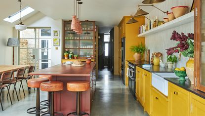
Part of mustard’s enduring charm has to lie in its timelessness. Unlike sunnier yellows, which can quickly feel OTT, the deeper pigments in mustard are easier on the eye. ‘Mustard easily mixes with natural finishes and plays well with a wide range of interior styles,’ adds Fiona.

Fiona Duke is an award-winning, professionally trained interior designer who is fully accredited with the SBID. She established Fiona Duke Interiors in 2014, and her enviable talent for mixing modern and vintage styles are in high demand across Essex, London and beyond.
10. Dreamy damson

Damson first stormed into our living rooms as the hit seasonal colour trend for Autumn/Winter last year and now it’s hotly tipped to go viral in the rest of the home, including to the very heart of the kitchen.
‘As people continue to be more confident with colour throughout the home, we’re seeing an increase in Damson tones used in the kitchen,’ reports Samuel Platt, Creative Design Manager at Homebase. ‘Damson provides the perfect statement to add richness and warmth to a space, whether it’s cooking up a feast, entertaining with friends or relaxing with a coffee on a Sunday morning.’
Samuel suggests working this strong colour with soft neutrals such mushroom and earthy tones. ‘Damson also works so well with sage, accompanied with brass finishing touches such as handles and kitchen taps, ensuring this versatile hue will be loved for many seasons to come,’ he explains. ‘Rich colours like Damson, and also Burgundy, are a bold design choice on their own, so make sure to not overwhelm or over-accessorise the space, this will help it stay timeless.’
FAQ
What is the most popular colour for a kitchen?
While blue and white are always strong contenders, green still tops the charts as the most popular colour for a kitchen right now. It’s no secret that green’s appeal lies in its associations with nature, and all the serenity and uplifting ambience that comes with it, but green is also crushing kitchen sales because of its excellent pairing powers. By which we mean, it goes with everything. Even blue, contrary to popular belief!
Green is also celebrated for the sheer variety on offer, which provides the opportunity to achieve very different looks. From modern zesty lime green to traditional soft green and everything in-between, there’s a green kitchen to suit everyone. And, assuming you’ll never tire of looking at trees or rolling fields, it’s unlikely you’ll get sick of the colour green while cooking up a storm.
Are white kitchens still in style?
White is the ultimate neutral, which is why white kitchen ideas are always in style. White is fresh and uplifting and also feels clean and hygienic, which is important in the room where you cook and eat. As white is always on-trend, it also has the best resale appeal, so you may want to consider white if you are hoping to leap up the property ladder.
White cabinets offer a versatile backdrop for a diverse choice of colours, finishes and styles but for the ultimate space-boosting scheme, take a white-on-white approach. Add texture to prevent a one-dimensional effect or add small punches of black on hardware to step into monochrome kitchen style.
Not all whites are the same. Pay attention to the undertone when choosing white paint; cool whites have hints of blue undertone, while warm whites have more yellow. ‘Most homeowners appreciate the benefits of testing paint colours in location but, with whites, it is crucial as they can be altered beyond recognition by light and shadow,’ adds Ben Hawkswell, senior designer, Roundhouse.
Which kitchen colour trend has caught your eye?
Get the Ideal Home Newsletter
Sign up to our newsletter for style and decor inspiration, house makeovers, project advice and more.

Linda Clayton is a professionally trained journalist, and has specialised in product design, interiors and fitness for more than two decades. Linda has written for a wide range of publications, from the Daily Telegraph and Guardian to Homes & Gardens and Livingetc. She has been freelancing for Ideal Home Magazine since 2008, covering design trends, home makeovers, product reviews and much more.
-
 Maisie Smith and Max George create a seamless flow in their new open-plan home with a brilliant flooring choice
The flooring makes Maisie and Max's home look bigger and very polished
By Sara Hesikova
-
 How to make your life easier with voice assistants - the invisible butlers that are always there to help
They're the modern-day invisible butlers who are always there to help
By Ginevra Benedetti
-
 What colours go with a grey sofa – interior stylists reveal how to style this shade for maximum impact
Personalise this popular sofa colour choice to your own individual style
By Sara Hesikova


