How to use the colour wheel - our guide to using this fabulous resource
Learning how to use the colour wheel will give you confidence for your own room schemes

Picking a colour scheme can be daunting. How do you know what will look good in your room and what are the best colour combinations? Understanding how to use the colour wheel is a great place to start. It’s a failsafe way of choosing colours that sit well together, so your home turns out just as beautifully as you’d pictured.
'The colour wheel is a scientifically developed illustration of how assorted colours interact with one another. One of the big benefits of using the colour wheel is that you can apply your choices to an online palette tool for a range of choices across a much broader spectrum. Simply put, combining the colour wheel with a palette tool maximises your choices,' says Adam Brown, director, The Painted Furniture Company.
By learning how to use the colour wheel, you will start to understand – and speak – the language of colour. This makes it much easier to describe what it is you’re really looking for. If you go into a DIY shop asking for blue paint, there's a good chance you'll come out feeling overwhelmed with choice (and swatches). But if you know beforehand that it’s a dark, saturated blue paint you’re after, the whole process will be a lot quicker, simpler, and more enjoyable, too.

While some of the colour palettes are tried and tested, others may well surprise you. Familiar with the phrase red and green should never be seen? Think again. We've put together an easy guide to get you up to speed, and boost your colour confidence in the process.
What is the colour wheel?
We’ve established the colour wheel is important, but what exactly is it? We like to think of it as a map for colour. It's basically a visual representation of where colours sit on the spectrum and the relationship between them all.
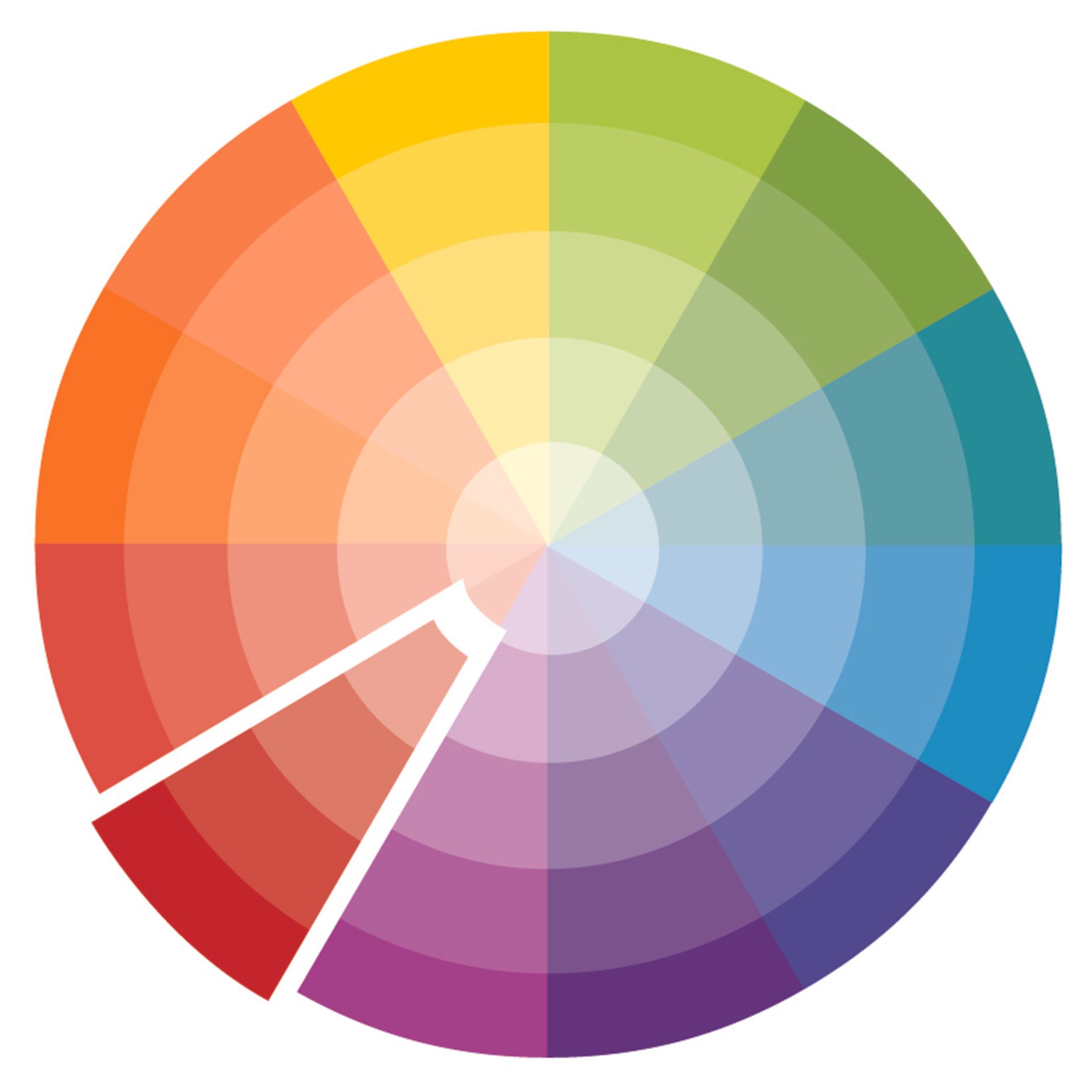
The wheel that’s used by today’s interior designers actually derives from Sir Isaac Newton’s first circular illustration for colour in 1666. It's made up of 12 hues, half of which are warm colours (reds, oranges and yellows) and the other half cool colours (lilacs, blues and greens).
'A colour is a mix of pigment that can be adapted by the level of saturation of that pigment, as well as be affected by external factors such as light and shadow. The essence of the colour wheel is to take the original three primary colours of red, yellow and blue, and then show the secondary and tertiary colours that can be derived from combining and blending them together,' advises Ruth Mottershead, creative director, Little Greene.
'There are elements of this theory within our 'Colour Scales' palette. Designed for ease of use, each colour is one of a graduated family, grouped in columns according to undertone. Shades within the same column can be used together for tonal coordination, or across columns to create a balanced contrast. The colour wheel is an interesting place to start within interior design, especially to understand the range within the colour spectrum and how each lead to other shades, however, I would suggest that colour choice is much more of an emotive, rather than a scientific decision.'

Ruth Mottershead is the Creative & Marketing Director of Little Greene, and has been working in her family’s business for 12 years. She is responsible for creating concepts and ideas for upcoming paint and wallpaper collections, choosing colours for new cards and browsing archives at the National Trust for new wallpaper collections. She writes content for the company’s marketing material, manages photoshoots and communicates with Little Greene and Paint & Paper Library’s customers.
How does the colour wheel work?
When deciding how to decorate a room, you first need to have a colour in mind. That part is easy, but if you're stuck look around for inspiration for colour ideas such as living room colour schemes and bedroom colour schemes. Next, in order to make that colour work to your taste and style, you’ll need to decide on a scheme. Not so easy. This is where the how to use the colour wheel comes in. Colours are categorised into groups: harmonious, contrasting and tonal, and there's more on that below.
While the colour wheel is without doubt a handy tool, designers like to make the point that there are no hard and fast rules when it comes to colour and interiors.
‘While it’s often a good starting point, the colour wheel should be treated as a concept, not a rulebook,' says interior designer Ann Marie Cousins of AMC Designs. 'It’s good to be individual. You have to follow your instincts to create a home you love.’
What are harmonious colours?

Harmonious colours (also known as analogous colours) sit next to each other on the colour wheel. They are the most widely used in interior design, and it’s easy to see why. The name 'harmonious' says it all. Choosing adjacent colours is a simple way of creating a harmonious scheme that’s easy to live with.
'Analogous colour schemes sound intimidatingly technical; however, they are simply colours which are together on the colour wheel. You just take a small slice out of the wheel, usually 3-4 colours. Think of it as colour ‘neighbours’, such as reds, oranges and yellows, or blues, violets and purples.
'They are a harmonious group of colours which sit together extremely well. In the natural world, you just have to look at a sunset and enjoy the red seeping into the orange and yellow peachy hues. Or, a peacock with its incredible indigo, teal and green feathers. It’s naturally pleasing to the eye,' says Emma Bestley, co-founder and creative director, YesColours.
'This way of decorating is best suited to a room where you wish to layer multiple textures and accessories. An analogous colour scheme allows you to experiment with grouping colours which you know complement one another.'

Homegrown eco paint brand, YesColours, was founded by friends, John Stubbs and Emma Bestley. Creative Director and Co-Founder Emma is perfectly placed to share her unique expertise on how to use colour in the home.

‘One dominant colour from the palette is used across the largest areas, walls, ceiling, large rugs, for example,' says Michael Rolland, interiors expert and MD of The Paint Shed. 'A secondary colour is then used across upholstery, window dressings and bedlinen. This leaves the accent colour, used sparingly to create a pop, usually through accessories such as frames and throw pillows.’
This clever design tactic is also referred to as the 60-30-10 rule. The numbers refer to the percentages used for each colour. Allow 60% of coverage for your dominant colour, 30% secondary and 10% for your accent. This makes it even easier to ensure a beautifully balanced scheme overall.
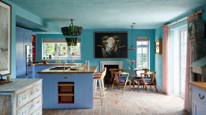
'Examples of winning colour combinations include a deeper blue, with a blue-violet and a teal green. All on the cool side of the colour wheel, but create an opulent setting when grouped together. On the warmer side, think of peachy tones with sunny yellows and a touch of terracotta red. It will feel like a drench of sunshine in a space,' adds Emma.
'Problems often arise when the wrong shade of colours are paired together. For example, bright red and green will instantly make you think of a Christmas scene. However, if you were to pair a muted burgundy red together with a warm olive, this works beautifully.'
What are contrasting colours?

Contrasting colours are those that sit directly opposite each other on the colour wheel. They are also sometimes referred to as complementary colours. If it’s drama you’re after, a contrasting colour scheme is the one for you. Examples include red and green, yellow and purple and blue and orange.
‘Using contrasting colours makes for an eye-catching room with maximum impact’, says interior designer Ann Marie. ‘A great starting point is colour blocking. Try painting your walls in two different colours or opt for one colour on your wall and another for furniture.’ Be creative with living room paint ideas to add personality and character to your space.

It’s worth bearing in mind that while the colour wheel is a useful tool for identifying contrasting colours, we still need to be a little mindful of how we go about using them within our homes.
‘A complementary palette makes colours appear brighter, making it a great option if you’re after a vibrant and bold interior. However, if you’re after a more understated take on the scheme, it’s a good idea to offset contrasting colours with neutral shades to avoid it becoming too overpowering’, says Katie Thomas, founder, KTM Design.
What are split-complementary colours?
We asked paint expert, Francesca Wezel, founder, Francesca's Paints, on her take on using this colour wheel option:
'Split-complementary colours are a variation of the complementary colour scheme. In this scheme, instead of using a single colour's exact complement, you choose the two colours adjacent to its complement on the colour wheel.
For example, if you have a base colour like blue, the split-complementary colours would be yellow-orange and red-orange. A split-complementary scheme creates a visually appealing contrast while offering more variety than a simple complementary pairing.'
What are tonal colours?

Tonal colours are different shades of one colour. A tonal scheme, also sometimes referred to as a monochromatic scheme is arguably the simplest of the colour recipes you can use for decorating. Not to be confused with monochrome meaning black and white, monochromatic schemes includes only different tones (lighter and darker) of the same colour. Start here if you’re unsure about contrasting combinations.

Decorating with tonal colours will most likely result in a fairly uniform scheme. However, there are easy ways to add extra dimension to the room. Using light and dark variations of your chosen colour is the most obvious way. Vary textures to differentiate the colours and make them look more interesting. Then add pops of natural colour with materials like timber and stone – and plants, too.

Helen Shaw, director of marketing (international), Benjamin Moore, explains:
'Deciphering what colours go well together depends on where on the colour wheel they sit. Consider creating a tonal scheme which uses varying levels of saturation of one colour. We would recommend using a paler shade of one and a darker hue of another.'
What’s the difference between hue, tint and shade?
In order to fully understand how to use the colour wheel, it’s important to familiarise yourself with the language – and get it right. These three words are most often used when discussing colour. However, they’re most often confused, too. Despite being used interchangeably, they mean three very different things.
- Hue: Forming the outer edges of the colour wheel, the primaries, secondaries and tertiaries, a hue is a colour in its purest form. As you can imagine, they’re pretty bold, which is why they’re usually lightened or darkened for most decorating schemes.
- Shade: A shade is created by adding black to a colour to darken it, making it deeper and richer.
- Tint: A tint is created by adding white, making the colour less intense.
What are triadic and achromatic colours?
A triadic colour scheme is one that uses three colours with one dominant shade and two equally spaced out accents – think of a triangle placed on the colour wheel – common colours are red, yellow and blue, purple, green and orange, and blue-purple, red-orange and yellow-green. Not for the faint-hearted – if you love bold colours this colour range are for you.
On the other end of the scale, achromatic colours are all shades of black, white and grey. Considered neutrals, they lack hues for this reason – achromatic means 'without colour'.
'Since our perception of colour is greatly affected by factors such as light and surrounding colours etc, even an apparently achromatic colour can reveal surprising complexity and ambiguity. A brief glance at a Fired Earth paint chart might leave the impression that there are several identical whites but closer inspection will reveal almost imperceptible but important differences.
One white might suddenly appear to have the subtlest of pink undertones in artificial light, for example, while another could take on a cooler blue or green appearance in natural light. This is why it really pays to do your research, testing out sample pots of various colours – even whites and blacks – to see exactly what characteristics they have,' says James Sirett, head of product, Fired Earth.

Using 'warm' and 'cool' colours
As you can see from the colour wheel, there are 'warm' and 'cool' colours within it. These can be used to your benefit depending on where the light and sun flows into your home. Ruth Mottershead, creative director, Little Greene, explains:
'It’s amazing how much colours can change from natural to artificial light. The orientation of a room is also an important factor. For example, south-facing rooms usually have warmer light, making colours appear more yellow, so cooler shades tend to read as more neutral, and warm tones can often be too intense, yet by contrast, north-facing rooms tend to make colours look consistently flatter and cooler than they would when bathed in direct light.
I would recommend always testing colours by painting samples onto a piece of A4 paper first, that way you can move them around the room to see how they perform in varying lights.'
James Sirett, head of product, Fired Earth adds:
'Cool colours tend to be characterised by blue undertones, while warm colours have reddish undertones. These undertones are important since they're fundamental to the perception of colour and the specific palette it will work with.
They're also often the reason that a grey can look 'surprisingly' warm (thanks to its red undertones) or that a pink might look unexpectedly cool (if it's blue rather than red-toned). If you look very closely at a selection of, say, greys, you'll really start to notice and appreciate these differences.'

What is colour psychology?
Learning how to use the colour wheel is part of a wider understanding of colour, also known as colour psychology. While the wheel is a tool used to determine colours that complement each other visually within a room, colour theory encompasses how these chosen colours may reflect – and affect – mood, feelings and emotions, too. By understanding the basics, you can create a room that not’s not only perfectly balanced, but truly reflects your personality.
So surrounding ourselves with colours that we like is guaranteed to make us feel good? Not always. While our colour preferences play a huge part in how we decorate our homes, colour psychology suggests we should be factoring in the nature of the room we’re decorating – what we do in it, how we want to feel in it, etc – and choose colours accordingly.
Colour psychologist Lee Chambers advises against using red in a living room. ‘Although red promotes energy and socialising, the vibrance can quickly become overwhelming, irritating and ultimately stop you from finding that restful rhythm after a long day,’ he says.
Get the Ideal Home Newsletter
Sign up to our newsletter for style and decor inspiration, house makeovers, project advice and more.
-
 George Home is selling a heated airer for the lowest price we've seen – it's even cheaper than Aldi
Snap up this winter must-have at a budget price
By Jullia Joson
-
 Frankie Bridge’s reeded glass bathroom door is the height of 'sophistication' – but we've found a way to fake it for £10
Frankie Bridge champions hotel-style living with a finishing touch to her bathroom – experts say it’s ‘sophisticated, decorative and functional’
By Sara Hesikova
-
 4 timeless wreath ideas that work all year round – not just for Christmas
Wreaths are set to be one of the biggest interiors trends of the year – so why not embrace them no matter the season?
By Sara Hesikova


